I like this website due to the navigation bar been to the right and you can just scroll down so its page after page. Although, the use of direction of what to do, does this make it a good website?
I like this clinical website. I like how the navigation bar is not the full length or width of the page. The use of the image is straight away an obvious notion to what the website is about. I like the use of negative space and the simplistic social media icons top right.
I like this website. The background is a video and moves around when it loads with the title over the top. This would be good for my website maybe having a video of someone on a rollercoaster. Although, I do think this would be quite difficult to get right, with only the basic knowledge we have been taught.
I like this website as it scrolls downwards and breaks each page up with an image. Although, if you wouldn't know how to work it out you have the buttons at the side which will also take you to the page.
I think this website is quite confusing for the homepage. I think there is too much on the page. The logos are a lot to take in. I think this has taught me maybe not to include the logos for each park as this would be overwhelming for the first page for the audience to come to.
I think this has too many fonts too. The different styles and font strokes is hard to focus on one word and you don't know where to look first. Also, I am not liking the navigation bar at the bottom as when you first come to it I had to look for the bar and this was the last place I looked. So this is something that I wouldn't do from this research.
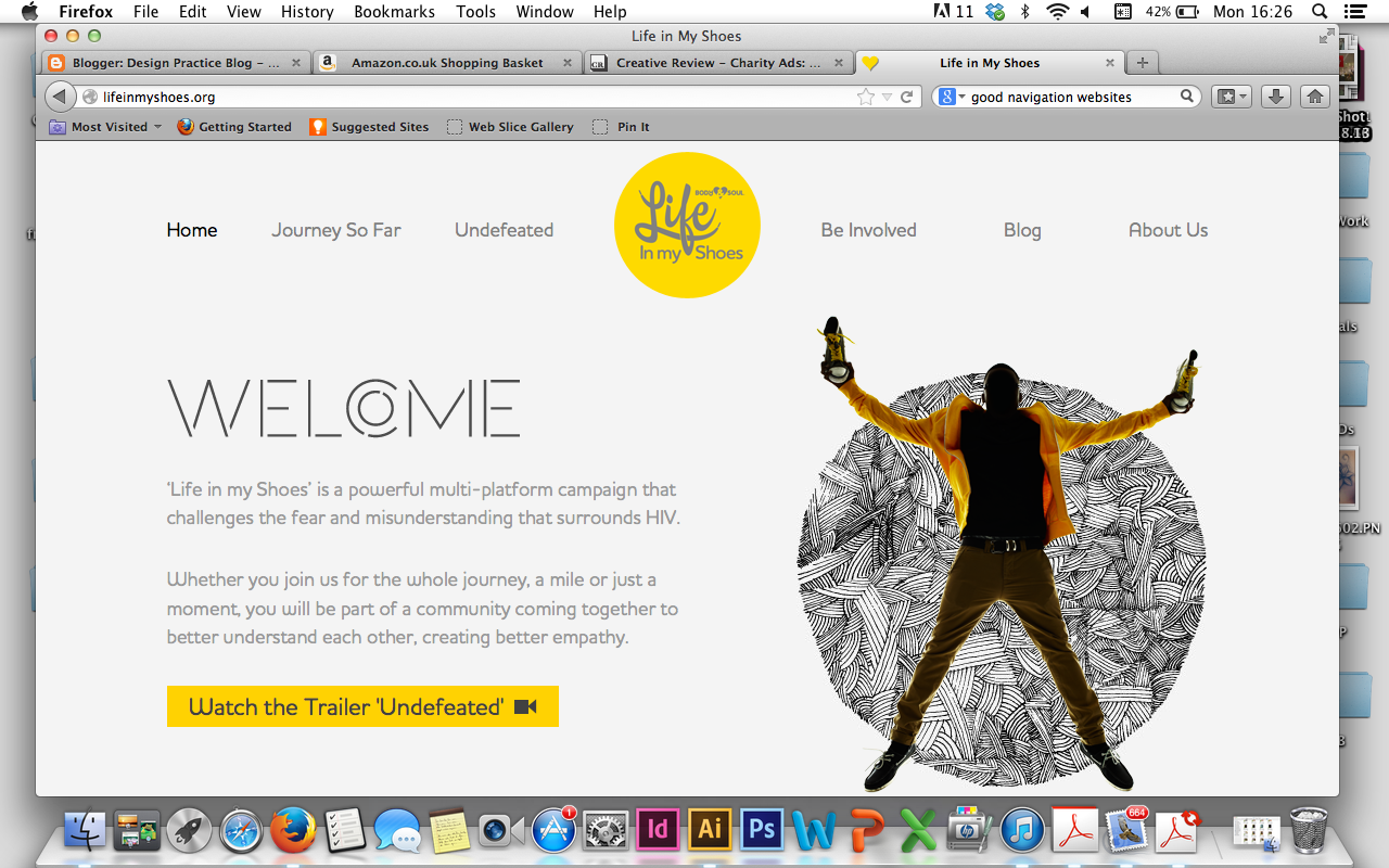
I like the clinical look of this website. The use of two colours works really well and one image so its not confusing to the eye. The navigation bar is very clear and I like the idea of the navigation bar been inline with the logo.
Again the use of an image behind the text although this does make it hard to read the quote straight off. This website does not have scroll and all the information fits within the screen. I like the use of opacity on the navigation bar as then you can still see the image behind and doesn't break up the screen.
I found this website confusing when I first got it because I thought the text box with the dots & arrows in was to change the page and therefore didn't realise there was more information below and this was just the image slider changer. Then the navigation bar was at the top in which you didn't see first & foremost as the image slider took centre stage.
This is similar to the website above although this video is just on the homepage and you can skip it or you can watch it then it automatically takes you to the homepage. This is therefore acting like a landing page.
This is a very interesting website, and I would look to be able to create something like this. You press the dots at the side and the aeroplane slides to that page or you can scroll to make the aeroplane go slow and you can see the scenery. Although, this website doesn't hold any information and I think it would be hard to add information onto this style of website.
I think this is a very innovative and creative website. I love how they have integrated the kitkat and made it in motion so it makes it more interesting. The pages are broken up by a picture again, which that I would love to be able to do. But I don't know what it is called to be able to research how to do it. You should do on it! The story of the kitkat it showed and the kitkat is shredded of its chocolate. Its very clever!
I like these infographics as buttons. The colours of pastels work really well against the white background.Although, you have no option of a navigation bar you have to scroll down. Also the scroll bar is not always there only when you start scrolling unless you knew about websites etc... you wouldn't necessarily know to scroll.
This website made no sense at all and I still don't know how to use it! The bike wheels roll and the blue section of the screen scrolls horizontally but it doesn't scroll or no buttons to change page the who made this link? is at the bottom which is very small and personally I wouldn't press it because of the uselessness of the page. When you press it, it takes your to there actual website but there is no reason for this, if there is no reason for your website its not going to work!


No comments:
Post a Comment