These are things I have found out recipes for and ideas for that I could possibly put in my package. I want to label the products so they know what sense they want to open. I like the idea of putting a stimulating word on there before they open it.
I like the use of lettering for the idea of wayfinding as this would be fitting with my aesthetic of design.
This is a cool what to direct people to different places. Although I only need one. I do like th idea of a line on the floor though.
This is very Alice in Wonderland, although, I feel this is only to direct through one door. You would have to have lots of arrows on the floor to direct you to that door.
This is very stylish, Although, I am not too sure if it would work. It is nice as a welcome or a goodbye but I think that this is too elabourate for the directions.
I like the idea of having confusing arrows although, this would not be beneficial. So if created many arrows with one saying the way to go and others giving wrong messages.
This is very interesting how they have hung it from a tree with a framing for the direction. I like this idea if the event was outdoor.
These are the wayfinding for the toilets in Disneyland Paris. I like the use of the imagery directing and then also the toilets been named the kings & queens.
I looked at the everyman cinema firstly to see where the use of banners would be and what would be the best place for my banner to be. I think the main banner would be the best place, I will try and keep it within the same style of block colour to the right with the description contained.
Then I looked at the other events I researched websites, so I could find how they promote their event & how they categories it. I like the use of the full bleed colour image and then the title in the middle this is very striking and then has an about page, past events & booking.
This website has no current events a due to it only opening in the summer months therefore this allows you to leave an email for the next upcoming event. This is a good option even though my event will be on going maybe the audience doesn't like the particular film so they can leave their email so they get regular email and wait till they see a film they like.
Again the use of the full colour image has been used, they are using the advantages of the scenery to get you in the mood of going to visit that cinema. I am not too sure about the nav bar been at the bottom as when you enter the screen there is no straight understanding of how to book etc...
So then I decided to look at event website and see what kind of pages they have and how they lay it out. I firstly found this the bumbershoot, they have simple pages such as tickets, gallery & get booked. I like the use of no words and the main use of imagery.
I like the use of the left aligning, I think this connotes the nonsense world. Although, I think its pointless although i do think its something that I will look at. Because the website that I am going to be designing is the multisensory website and therefore wouldn't want to set the whole website in this style.
This is a very basic website where you can buy tickets only, this is something what I need but I think that I need to have the ability to be able to explain the event to make sure I get the best targeted audience.
I like this how there is a count down the the event and a guide to what is on on each day. The aesthetic is very simple and clean layout which is similar to my design on the printed products.
I thought this would be a good way to send out the information of the event though postcards within one envelope. I like the idea of the information been nonsense.
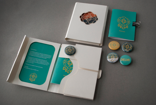
I like the idea of having a package that I could send out without an envelope so that they would know what it is straight away. I like the idea of having everything held together in an interesting way.
I like the idea of personalising each envelope with interesting cut outs and textures etc... Although, this would be impossible for due to the size of the event.
I like the idea of sending them a package so that they could get a pre-sense of what to expect. I think a little gift that would give them an idea of what to expect would be interesting. I like the idea of giving them a 3D box as you are more excited to open a box rather than an envelope.
This is a poster I came across during my research, this is not a normal movie poster as this is a short run piece. I like the idea of having the tactile of paper so people can touch the detail etc...
I like the colour scheme on this poster, although, I don't like the layout I feel that this is too confusing.
This is a very geometric design, I find that this is a very sophisticated design and maybe not fitting with the film although, I do like the representation of falling down the hole.
Again the cards have been used to represent the film. I like the use of the manipulation of them also using this wine bottles. I am thinking that this is going to have something to do with the type of event.
This is a film poster that was created for the Tim Burton's Alice in Wonderland. I like the use of the obvious icons of the queen of hearts and therefore the need of the whole picturesque is not needed.
The aesthetic of this layout is not very appropriate although, I like the size of this ticket, I like the use of the space.
I like the shape of these old tickets with the curved inwards corners. This is a typical old cinema ticket. Although, I think these are too small for today people use tickets as the first point of call. A place they look to refresh their mind of the date, time & venue.
I like the simplicity of these tickets. They have the basic information on and that is all that it needs. I like the use of the different colours although they work very well, they wont be given out together so therefore it doesn't matter if they all work together or not.
I am loving the type directed tickets. Although, I do believe that this has too much information on. I like the use of the justified type. I like how all the important information stands out due to the boldness of the type or the red used, also the use of the X & Y axis. I also like the outline of the ticket. I think this creates a frame and therefore will lead to good strong layout as you wont overwork.
This is a poster that I have found when I was researching into the lettering of alice in wonderland. I like the use of the different styles within the one poster.
I like this style of lettering, I like the use of different styles for each title although, I would like to keep the same consistent style throughout. And also the use of the same colour, to create a brand recognition. And to keep the aesthetic seamless.
I like the aesthetic of this lettering it has a very interesting layout with a slight background image. The slanted type reminds me of the nonsense world also. Although I am not 100% on the colour scheme as I don't think it represents the film very well I do think the colour palette is interesting within its tones etc...
I like the interesting initial A, it has the style of the film with the heart and the the flower from the e. I think it has a very girly aesthetic which is perfect or Alice, then the in wonderland just underlining as you know exactly what it is from the Alice solely.
This is a very interesting colour scheme. I am liking the outline framing the title but I think that the lettering is very boring.