Firstly I started with the instructions for the paper crane... This I thought would take a long time and therefore wanted these to be nailed before designing the poster so I knew what elements I had to put in places.
This then was laid out so the step was clearly differentiated. I put 4 steps on the front page so that the the steps looked easier and then I place 5 on the back side.... These were all placed on the bottom strip which will be perforated off so that they can start with a square!
I then started with the layout of the top of the poster.... I started with thinking that the cleaner look will probably get the information across easier.. But then I thought about my target audience and didn't think this was working.
I then started to do some handwritten type... This creates more a friendly tone and therefore is working alongside the engagement model of making things look appealing and approachable.
Then I started working with all the elements of the title, I decided to go with share some luck today! This I thought was intriguing as to why they should share some luck and made them think about what luck they have etc....
I decided to join hand rendered fonts and typeset one together so the layout wasn't over powering and confusing to the onlookers eye.
I then also decided to put more fun within the layout so added some illustration of a well known luck symbol of a horseshoe. This outline was traced along a current picture and the detail was added after.
I added a short caption so they can find out more about the paper crane... This is only read once the initial interaction has occurred and therefore this is following the engagement model.
I then add the logo of the chosen charity I thought this was a key aspect and therefore tried to make it a focus of the page will the use of the Believe in Children green font also... I have also moved around the layout to make sure the poster is well balance and reads effectively. The use of the little clover icons are to simply fill up the white space as this is not attractive when designing for children, doing this has allowed my design still be simple and clear but with the attention mainly towards children...
This is the final front of the poster...
Starting with the back...
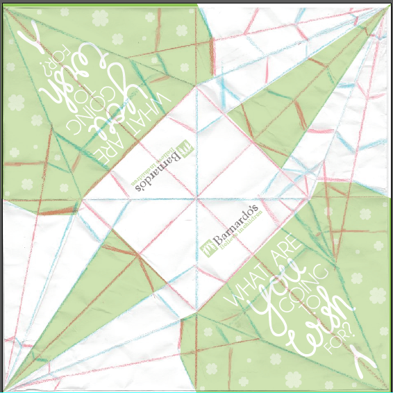
Firstly I decided that I would fold up a paper crane using the same size paper and then design the crane while in position. Then I would unfold it and see where this design would need to be.
Then I scanned in an unfolded paper crane so i could see the lines on the computer...
The red lines are the cosmetic folds where they are the folds that will not create a definitive line.
Then I created the colour blocks using this pattern...
This then allowed me to see where the wing ended and how much room I had to I could put a message on the wing without any chance of it over lapping. This followed the same aesthetic as the poster where as there is a mix of hand rendered and digital.
This was then applied to both sides...
Both wings have the same message. With the neck and tail just having green as they are both too thin to have any text on them... With the logo of the charity on the main body...
This side doesn't look as inviting as the other side and looks very
complicated. This is why I created the poster double sided, as I knew
from the research that the aesthetic was an important feature when
getting people to interact. If they think it will take too long or looks
over complicated then they will just not engage.
The same process was then created with the second paper crane which just simply had a different slogan on it....


No comments:
Post a Comment