Secret 7 Live Brief
This brief tells us to create a 7'inch vinyl for one of the artist songs below:
Public Enemy
Elton John
Naz
Jessie Ware
Hiam
Laura Marling
Nick Drake
Have to design the front of the vinyl from the song given to us of each artist, we are not allowed to feature the name of the artist or the title of the track.
I have listened to all of the songs and the one that stood out to myself is Jessie Ware as when I was listening to it was a very happy song and thoughts came into my heads of what I could design.
Listening to the song
Echoing lyrics that pose questions about a romance that’s gone a bit
sour. It’s a song that is, on every level, about uncertainty, but Jessie
Ware’s phrasing on her lead vocal parts goes against that grain – she
lets on a bit of wounded defensiveness, but her tone is stern and sure.
This relationship may be a mess, but she knows her love is real, and you
can tell she really wants to know if her partner still loves her too.
She sounds willing to fight for this, at least if they’re up to the
challenge as well.
This is a unofficial video i found which uses 1970s video footage which works really well with the song.
Jessie Ware
'Still Love Me' has
an effortlessly golden chorus of pop joy with the repetition of 'Do you
still love me' in some harmonic variations. 'No To Love' follows on with
its slightly simmered down manner, but the subject of 'love' makes it
sound like one lengthy track. The reoccurring 'who says no to love?'
begs questions like the previous track in its lovesick daze.

Jessie Ware is making a name for herself in the
music world but her debut album, Devotion’s, marketing campaign is also
gaining notoriety.
Rather than the standard billboard campaign Studio Moross who spearheaded the project decided to get the public involved with an interactive billboard. The poster put up in London promoting an exclusive performance with Redbull UK was made up of hundreds of dots that needed to be filled until the artwork was finally revealed.
Rather than the standard billboard campaign Studio Moross who spearheaded the project decided to get the public involved with an interactive billboard. The poster put up in London promoting an exclusive performance with Redbull UK was made up of hundreds of dots that needed to be filled until the artwork was finally revealed.
This is some of Jessie Ware's current design work:


The use of a image of the artist on the front sees to be a popular choice of most modern artists now. Although i am not very keen i think it should have some relation to explain the album meaning. Same as a book, you read a book by its cover.

Again her photo is used although some manipulation has been used, i do like the pop arty influenced used for the effect. This side silhouette seems to be a popular position she likes to use and be photographed in.


These are all of her images that have been taken from the side and therefore seems to be a key focus of Jessie Ware. There are also many more these are just a selected few. This is just something I noticed when researching and looking into her past design.
Simular artists CD covers:


I searched for similar artists as Jessie Ware to see there album covers to see if more designing has been used rather than just the basic imagery or type only. And Lianne Le Mayas is very similar artist to Jessie i like her cover it looks very earthy and hand rendered. Also the manipulation of Natalia Kills imagery shows some differentiation compared to normal CD covers. She is also very similar to Jessie Ware.
Other Vinyl designs:

I like the use of the cream background and the colouring of the roses. Roses has a main connotion to love and therefore would be a good object to use within my vinyl.
 I like the use of mix media on this design. The basic use of colour and then slight bright highlights throughout the design, against the grey background.
 I like this design very much i like the hot dark colours slightly been able to see them through the opaque foreground in areas, The effect of the photo is very night with good colour choices.
 I like the use of the Victorian frame in this one to edge something make it more in focus. The black and white drawing is very effective surround the colourful drawing.
 The reds really stand out against the background of this design. I like the white frames edging the poses of flowers. This would be very good to use roses and edit the picture so they are this red as this would be a good relation to love.
 This is very striking and the wave of colour against the pink inside the mouth makes and therefore makes the mouth stand out. The simple three colour block palette.
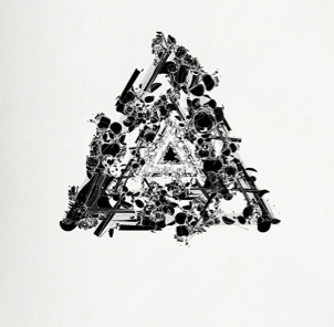 I like the design of this is reminds me of echoing and repetition which is appropriate for the track Jessie Ware. The simple black against the cream background is very appealing to the eye. I like how the triangle is visible without clear lines.
 The threshold look I like again the repetition is show through multiple of the same image. The white black and grey is a very sharp colour scheme but I think it works very well with the design itself.
 This is very effective and although its a published poster i think it would still work with a cd cover. I like the colour scheme and the shape used. The use of the same picture in some to allow you to make out what the picture is, and then other pictures as well is a very good idea.
 This kaleidoscope effect is something i first thought of when I heard the song because the syncopation of the song is very broken and there for reminded me of a moving and stills of a kaleidoscope. Although I think there does need to be colour in the central image.
 I liked this due to the bright colours against the bright background. This design relates to echoing and like movement through a black space.
 This is the same use of a triangle which i think is very apparent in CD or vinyl covers. The colours are very vibrant. The reflection of the triangle, which shows repetition echoing like rippling through water.
 This photo represents echoing due to the foreground been crisp and then blurry the further it gets which is like loud echoing it become muffled and not recognisable.
 I like the use of using the drawing more than one but only moving a little and then reducing opacity. I think the background colour maybe would work better in black with a white drawing?
 I like the use of the repetition of the heart on the outside in different colours & enlarging it. The colours are very summery and the type if very fitting for the artist very hippy and fits in with the design of psychedelic style.

I like the heart in the background as i like the pixelated look. The colours are very appropriate too which help to add to the disco style. This would be good fro the song due to the heart not been shaped properly and therefore its like confusion in love what it look like etc...


I like the heart in the background as i like the pixelated look. The colours are very appropriate too which help to add to the disco style. This would be good fro the song due to the heart not been shaped properly and therefore its like confusion in love what it look like etc...

When i was researching into love design i found these fridge magnets and they fit into each other to make the yin yang symbol when joined together. So this maybe a good idea to play with in my designs.
No comments:
Post a Comment