10 Things You Need to Know as a Graphic Designer
Research For Layout

I like the balanced layout in this double page spread. The pictures centralised and placed in line with the body copy. The use of the slanted title is very capturing as its in block capitals and very bold compared to the rest of the page.

I like the hand rendered font spread out across the double page spread. The use of a bright colour makes you read that first compared to the basic bodycopy. The irregular line of bodycopy is still legible to the eye and still flow to the next column with ease.

The title on one whole page is very aesthetically pleasing to myself. The broken down bodycopy is very irregular and makes it uneasy to follow although this is fitting for this subject of this editorial piece.


This could become very illegible when reading due to the comparison of colours would be hard to justify against both the background and logo colour. Therefore would have to be very similar and therefore not much point.
Colour & Stock Research

I like the use of using colour for the bodycopy rather than plain old black. As this is a very safe choice. The block numbers at the bottom of the page could be something I might play with as this is very appropriate to the title of the brief.

I like the use of using three colour palette. The bright colour for headers and the black and white for stock and bodycopy.

The use of using a coloured stock to enhance the look of the design is very appealing to me. I like the pink and blue colour scheme. It gives it a very unique look. This is using stock to its full potential.

The use of using black and white for the information and adding colour through the images is appealing to me. Due to the thought that I will have to use more than one bright colour through due to the RGB & CMYK colour systems been part of the subjects.

I like the use of cream stock and the antique white look. It has a nice luxury feel also.

Although the use of the satin stock would make it look very professional as this is the stock used in most editorials when bought for luxury such as Elle, Vogue etc...

I thought the system of this was appealing at first although the information would be very limited due to the space. The use of division it something I might play with for this publication though.

Again this is the style, I am most drawn to due to the use of different colours needed rather than just one more added colour.

This is again use the stock to an advantage and the use of monochrome allows this to be able to work. As this is a difficult skill as your don't know what it is going to look like until you print it out.
Binding Research

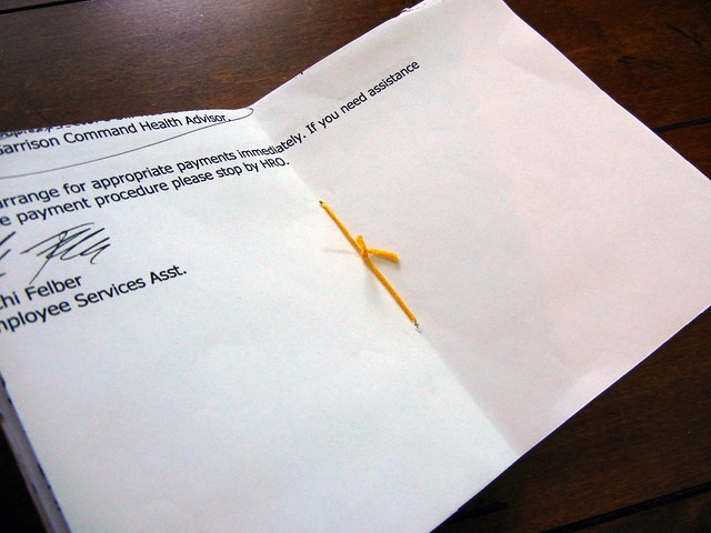
This is a very simple binding but the cutting of the pages to create the simple binding is quite complicated. Although, I like the use of the bright colour added into the binding rather than plain cream or black.
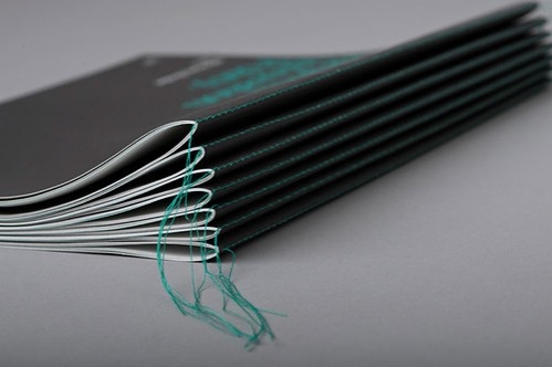
 This chunky stitch is very hand generated and this is the main reason why I like this look. The different techniques here all look appeal appealing to me. Maybe the use of a chunky thread could be a possible choice to create this look.
 This is a very simple binding and will work well for a small book. But quick which is what I need due to only having one day to bind as that's the earliest print slot I could get.
 The use of a zine could be a possibility and therefore could be a cheap things that could be main weekly like a newspaper for tips for graphic designers. This is one of the ideas I have had.
 Although the use of a small book like a pocket mag so it is compact and can be carried around and not too bulky that they can take everywhere they go and can take advise when the most need it.
This created by a sewing machine. I like the use of unfinished edging as this is again the hand rendered look. This is cold be the best possibility.
Type of Editorial
No comments:
Post a Comment