After The First Critique:
So at the first critique we just presented our ideas and told them the main things about our publication and what they thought about it and if it was relevant etc... They all said that it was very good and innovative idea although I should be careful doing pop-ups as they can be very difficult & trouble making. They also mentioned the idea of doing a quiz at the end of the book to test there knowledge they have learnt throughout the book. Which I think I am going to trial out when designing the book.
Then I started creating mock-ups during the Easter Break as I had to decide what pop-ups I wanted for each page before designing to know the space I have left to include information etc.... I thought it was gong to be more difficult to do that it was due to the fact me having not done pop-ups before and tackling a new skill.
This is tackling letters for my pages of how to differentiate between helvetica & arial. I wanted a simple modernist pop-up as it wouldn't look very fitting for the subject other wish. So I chose the most sophisticated look of the pop-up to use for these pages. I eventually worked out measurements and the minor details to where to stop your design etc... I think they have worked very well & have created a very good look.
This is for my variations page. I didn't just want this to be a boring list so when I seen this in my research I knew it would be perfect for this page to divide and separate each typeface in the font family. I trailed this with a few paper types the best was card but this didn't look as good against the cartridge paper so therefore chose to use the same stock and get a less effective look.
I wanted to have a page to enhance the fact that helvetica is all around you & you just don't realise so I thought of using this phrase "Helvetica in the Wild" this is then backed up with this pop-up I found as I wanted a cage around it so the aesthetics would look like it is trapped.
I ain't using pop-ups for every information page so I thought by doing title pages for each section would be a good way to allow the pop-up theme flowing but also not effective the amount of information that can be put into it.
This is just something nifty I found in my research again. I liked this for the pages of Arial Vs Helvetica as they are both backing each other and opposing the look.
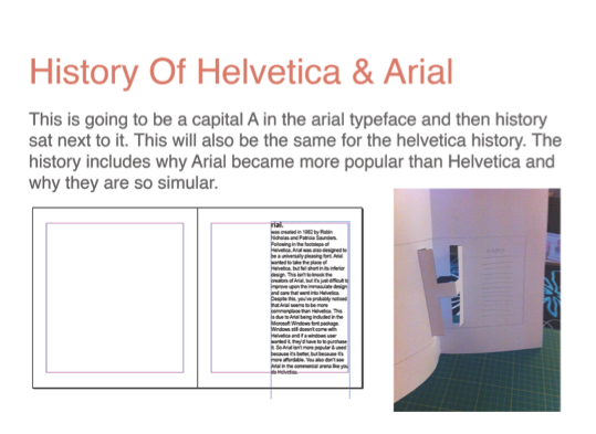
For the history pages I wanted to create a Large drop capped look. This is the best way I could think of how to do it. It took many attempts as I kept cutting the wrong parts and therefore would just flop over etc... But this is a good eye catcher and therefore eases the block text at the side.
I chose to use this plane pop-up to hold my helvetica in the wild photos and the test of logos to again keep this pop-up theme running through as this is a large section of the book and is finishing off the publication.
I chose to highlight the obvious point straight away by overlapping and showing the main difference in the letter a and therefore merged the names of each font to create a new title for my publication.
The second critique:
This is what I showed in the second critique and backed up all my decisions and how I was going to create the publication and what was going to be in it.
The feedback they gave me they mentioned that I could possibly put in a timeline to make sure that I am putting it into context. So therefore I created a timeline correlating both typefaces to show them in comparison with each other. Here it is:
I am very happy with this and it links in with the modernist aesthetic style. Very clean and sharp. Like the contrast of colours and the choice of using geometric shapes to add style to the timeline rather than it been boring to the eye.
FINAL
Evaluation
Overall I am very happy with my publication although I found the binding of the book became more problematic than I thought as the pages stuck together due to the cut outs. It took a long time to sort out the fiddly binding and had to back each page twice due to the cut out leading to a messy look. I think the pictures of Helvetica in the wild are very blurry now printed & if I had more time I would have retaken them to make sure the look was crisp rather than pixelated. Finally, I have realised that I have forgotten to put the answers page in. As when I came to stick the plane photographs on I realised that this was missing and there was no way I could have added it in. But i am very happy with how well the pop-ups worked and how well they have fitted in with the modernistic style, as at first I was very debatable that this would be a flowing concept and outcome.
END OF MODULE EVALUATION
1. What skills have you developed through this
module and how effectively do you think you have applied them?
|
I have developed my writing
skills in this module and I think I have applied them very well through the
development of my essay. Also, I learnt how to Harvard reference, this is the
first time I had to use this skill but seem to grasp it very well with the
information given in the session.
Finally, I think I have
developed my synthesis well as I wasn’t too sure of how to do this but it
seems that my theoretical & practical contexts are well connected and
have a strong relationship in my publication.
|
2. What approaches to/methods
of design production have you developed and how have they informed your
design development process?
|
I have developed my approach
to producing a publication. I thought it would have to be a book and then I
realised that I wanted to become more adventurous and went and researched how
I could do this with a good relationship with the subject matter.
Also, I have also learnt how
to manually bind a case bound book. This was a very long process, and has
been a large part of my production. The case bound book was more advanced
than a case bound book also due to the pop-up cut out pages, it was very
fiddly to glue and had to back all the pop-up pages with another piece of
paper, then glue each page next to each other to make it into a book.
|
3. What strengths can you
identify in your work and how have/will you capitalise on these?
|
The strengths of my work is
the pop-up, I think I worked very hard on the mock-ups of the pop-ups and the
research that went into this also. I also believe that I have allowed the
style of Helvetica/Modernism through to my book even though I used a very
unusual way to show this and make it more interesting as its two subjects
that you think would have gone together. I wanted it to be a challenge and difficult
for me rather than just typical pop-up.
|
4. What weaknesses can you
identify in your work and how will you address these in the future?
|
The weaknesses in my work
maybe would be the binding as although I think the outside is very neat and
professional but some of the pages have stuck together and therefore some of
the pages has ripped.
Also, I think that the paper
has become a great downfall although this was the thickest paper that I could
print on, as it needed to be thick for the construction of the pop-ups. The
print quality is rather bad as the printer I used doesn’t print well on to
cartridge but I didn’t know this until it was too late to restart, therefore
the images are very blurry and the print is transferring on the other side of
the DPS.
Finally, I forgot to print
the answers page for the quiz at the back. Although I did design this, I
didn’t realise till I stuck the back page to the cover.
|
5. Identify five things that
you will do differently next time and what do you expect to gain from doing
these?
|
1.
Refine my Idea thoroughly before printing out as some bits I had to reprint
& work out a different way to join it into the book.
2.
Secondly, I would maybe put more information to connect it to other factors
outside of the typefaces. This would have strengthened my synthesis and shown
mine understanding of the context in relation to the world.
3.
I would make sure the images where taken with a better camera rather than just
my phone and therefore they might not have so much pixelating.
4.
I would make sure I had more time to bind inside of college rather than having
to take it home and resolving my own problems rather than having specialist
help. This is due to the time scale of having hand in after bank holiday etc…
5.
Finally, I would have blogged as I went along rather than just blogging at the
end. This is always my downfall but this is going to change. As I could have
possibly spent more time on my essay or publication at the last minute rather
than blogging.
Attendance
5
Punctuality
5
Motivation
4
Commitment
4
Quality
of Work 4
Quantity
of Work 4
Contribution
to the Group 3
Final Critique Peer Feedback hand-in.