Sunday, 28 December 2014

Invitation Design Development

So from the research I carried out I noticed that you need to get the audience to engage in some way. The reason for an invitation is that you don't necessarily go to the mall so because it's there a short amount of time, if you get invitation you might make a special journey... this is setting the audience, by not giving too much away as we don't want them to be either too high with their expectations but also enough to make them want to come..

Firstly I worked out how I wanted to make the invite interactive as this would need to match alongside the exhibition. 

So I thought about a simple fold that would make in the invite into an interesting layout and shape. Also, maybe give them a little gift to get them thinking about the exhibition and make them want to investigate with the paper crane...

So i have come up with the idea of a diamond shape as this is the outline of a Celtic knot. Again making the connection with luck and the Irish.

I ripped a piece of A3 paper in half  and folded from the centre to make a diamond shape....

 I noticed that I could folded the edges in to make a gate fold and therefore the information inside would be sealed with a grand opening of the two sides. This was just a happy accident.


 So this is what it would look like if it was folded in... I like this because the idea that the information is concealed and therefore people will wonder what is inside so they will make the initial interaction. Also it is small, compact and can be stored/stacked easily.


This would open like this so I could follow the creases of the paper for my layout, following the aesthetic of the back of my poster...


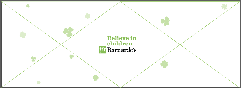
So I created a simple template on illustrator to follow to make sure all the elements worked. I thought using the same title as the poster and the same style would create a connection and then people would be like oh that's what those invites was for... etc.. I have block coloured the diagonals as this is going to be the outside of the invite. Now to create the front, which will be divided by a gate fold.


 This will be the front of the invite, this is giving them slight details with an illustration which will create curiosity and make people open the invite to find out more...


 Although this will be divided like this so that the fold can create the enclosure...


This was my initial thoughts as I thought having the charity hidden by the mini paper crane we are going to have in the middle will be a grand reveal, but then I thought this might not be a good idea people might be more inclined to read if they can see the charity logo.


So I chose to put it in the bottom left.... This is not the first things they are going to look at but at least it doesn't need something to be removed for them to see it. Also a small caption has been added to tell them a little about the age range and telling them about the concept of luck.. The how to build a paper crane will only be revealed if the invitation is fully interacted with... Therefore these are the people that will most benefit and enjoy this task...


I have put that it is around St Patrick's day this will given them some connection and therefore won't forget what date if the invitation is lost etc... I have now put how to build a paper crane underneath where the crane will be placed to give them some information as to why the paper crane is there but not in too much detail.


 I have also put the date, as I realised that this would just be relating to one say if St Patrick's day was left to be the only date contact info... I have now out dots around the crane to connote that this is what the whole exhibition is about... But this is only a slight clue and not everyone will put two and two together.


This is the final outcome, all sections have some information on them... And it all looks evenly balanced out with the focus on the paper crane.... This invite is giving away everything but nothing directly, therefore create curiosity, which is the main element to make people come and engage with the exhibition.


This is the final printed outcome.... 


The paper crane doesn't fully cover up the writing which I am glad about as you can see there is information underneath that needs to be revealed, therefore more people will be inclined to remove it..


Monday, 22 December 2014

Additional Material? What else does it need?

I need to make something to make sure we get enough support...
To make sure people spread the word.... 

Promotional Banners around the mall.
Invite to send to people - exisiting Barnardos volunteers, leave in mall near guides.
Que barrier to make sure people know what the others are queing for..?

Insipiration for invitation

I like the idea that they have to do something to make the detail legible... This is formed from a simple instruction....


 I like the use of folding as this will have the same concept as the paper crane...


 I like the idea of folding the paper to create an unusual shape...


I love this invitation, although is it practical? Once it is up its up and therefore depending on where your receive this you might have no where to put it..


I am also going to mock up the other too promotional items as i think these will all be beneficial for the engagement mode.

Thursday, 18 December 2014

Interactive Poster Design Development


Firstly I started with the instructions for the paper crane... This I thought would take a long time and therefore wanted these to be nailed before designing the poster so I knew what elements I had to put in places.


This then was laid out so the step was clearly differentiated. I put 4 steps on the front page so that the the steps looked easier and then I place 5 on the back side.... These were all placed on the bottom strip which will be perforated off so that they can start with a square!


I then started with the layout of the top of the poster.... I started with thinking that the cleaner look will probably get the information across easier.. But then I thought about my target audience and didn't think this was working.


I then started to do some handwritten type... This creates more a friendly tone and therefore is working alongside the engagement model of making things look appealing and approachable.


Then I started working with all the elements of the title, I decided to go with share some luck today! This I thought was intriguing as to why they should share some luck and made them think about what luck they have etc....


I decided to join hand rendered fonts and typeset one together so the layout wasn't over powering and confusing to the onlookers eye.


I then also decided to put more fun within the layout so added some illustration of a well known luck symbol of a horseshoe. This outline was traced along a current picture and the detail was added after. 


I added a short caption so they can find out more about the paper crane... This is only read once the initial interaction has occurred and therefore this is following the engagement model.


I then add the logo of the chosen charity I thought this was a key aspect and therefore tried to make it a focus of the page will the use of the Believe in Children green font also... I have also moved around the layout to make sure the poster is well balance and reads effectively. The use of the little clover icons are to simply fill up the white space as this is not attractive when designing for children, doing this has allowed my design still be simple and clear but with the attention mainly towards children...


This is the final front of the poster...


Starting with the back...

Firstly I decided that I would fold up a paper crane using the same size paper and then design the crane while in position. Then I would unfold it and see where this design would need to be.

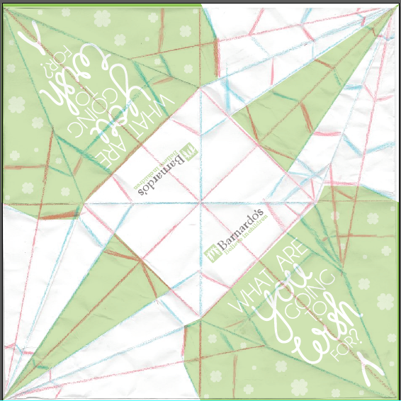
Then I scanned in an unfolded paper crane so i could see the lines on the computer...

The red lines are the cosmetic folds where they are the folds that will not create a definitive line.


Then I created the colour blocks using this pattern...


This then allowed me to see where the wing ended and how much room I had to I could put a message on the wing without any chance of it over lapping. This followed the same aesthetic as the poster where as there is a mix of hand rendered and digital.


This was then applied to both sides...

Both wings have the same message. With the neck and tail just having green as they are both too thin to have any text on them... With the logo of the charity on the main body...


This side doesn't look as inviting as the other side and looks very complicated. This is why I created the poster double sided, as I knew from the research that the aesthetic was an important feature when getting people to interact. If they think it will take too long or looks over complicated then they will just not engage.


The same process was then created with the second paper crane which just simply had a different slogan on it....


Friday, 12 December 2014

Interactive Poster/Exhibition & Engagement Model


The first stage will be set by the roll down posters and invites sent out... they know about making a paper crane, but they don't know why? There is a caption on the poster saying to follow the instructions but they don't nessarily know what they are making..

The second stage is when the initial interaction starts, it needs to be informal and appealing, this is why I have use a friendly font, with easy to understand language. I have only showed the first few steps on the first side as then they can be spread out and look simple and then the second side is when the folding becomes more complicated and the second side has 5 steps whereas the front has 4.

The next engagement phrase is anticipation, you have to allow this to happen with gratifying the audience by giving them a sense of achievement, which will then lead them into the next phrase nicely. This is where the participant will see the crane coming together and therefore this will be the sense of achievement.

Finally the participant will need time away from interacting to reflect, this will come into effect when they see their paper crane hanging with the rest of them... They can take time to reflect and think about their wish they will be granted.


Thursday, 11 December 2014

Jinsop Lee Ted Talk

Design for all 5 senses

Us as designers mainly focus on making things look pretty with a little but of touch, which means we have ignored the other 3 senses.

Raising just one more of the other three senses, we could make a brilliant outcome.

We have 6 emotions:
Smell
Hear
Taste
Sight
Touch
Emotions

"Great Design is one that pleases all 5 senses"

"Challenge the paradigm that graphic design can rely on the visual, we have 5 senses lets use them" - Kate McClean.

Adding texture to your design is as simple as picking a paper stock that feels high quality. In addition certain printers will offer scents through varnishes that allow the audience to engage with their olfactory sense.

Engaging Multiple sense also gives more opportunity to make poor choices. Adding a jagged edge with die-cut to flimsy stock for example can deliver a negative sensory experience to the audience.

Interactivity doesn't just mean through multimedia it means the involvement of the viewer, through tradition media.

Having the viewer carry out an action as a direct result gives the outcome more force and dimension. It builds the image and understanding in more than just visual areas.

New technology has meant that we all work differently anyway.

Solving problems of visually communicating a message on a flat surface.

Need to communicate in a more holistic way. A way in which involves the receiver more, and requires more of the receivers input to work.

Wednesday, 10 December 2014

Overall Concept of Practical & Synthesis

The synthesis between my practical is grasped from many angles within my dissertation.
  • Engagement Model - Exhibition - Goes through the stages.
  • VAK Learning Styles - Kinesthetic Learning style - from the outcome of my essay the kinethetic learning style was the most effective as it covered all areas and everyone learns something from working hands on whereas this can't be said for the other styles.
  • Rewarding stages - Stickers - Although the reward should be the paper crane they have made, they are going to be part of the exhibition so this will detriment the reward, therefore the use of the stickers has been put in place.
  • This is a good example of the dependance on the subject because of the medium of print has been developed from the message of luck... It wouldn't be as effective if you had to click to create the paper crane. Hands on through print is the only way you can make a paper crane therefore digital wouldn't work for this message.

Friday, 5 December 2014

Primary Research

Emailed Questionnaire


This is the email i sent to and all the different email addresses I sent it too...


I didn't receive any replies for quite a while and then I received one back from mark at the engine room...

I was very dissapointed that I only received one email and felt quite dissapointed and disheartened.


So then I decided to do more primary research and I carried out an experiment to see which medium gave the best result for a simple task....


Methodology


This is an experiment carried out due to wanting an understanding whether physical and digital objects differ within interaction level and learning styles. The experiment consisted of completing a simple task of shape sorting with the two different medias. To get a fully honest outcome it was vital that a task was chosen, that would be at the same level with both medias. The task made them to stimulate their minds to recognise the amount of right angles the shape has to put it in the correct category.

The key variances between the two tasks of digital vs. physical, is that there was a lack of ability to hold and focus on one shape at a time within the 3-dimentional environment with the digital condition compared with the lack of multimodal feedback within the physical task. This allowed focus on how the changes between each condition influenced the speed of interaction.

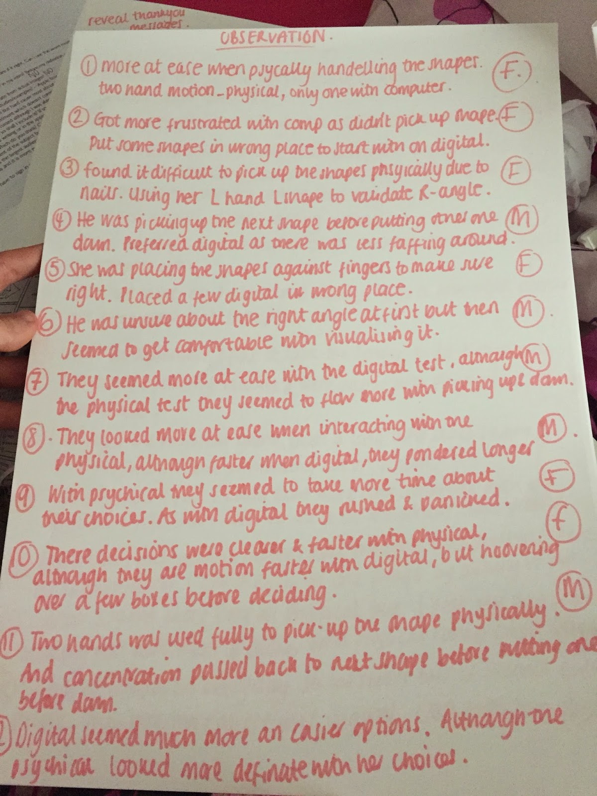
The tasks were documented in two forms. Firstly, the times where noted and then the difference in times between the two tasks was noted. Then an observation was recorded in terms of movement and anxiety etc. Followed by a simple question was asked of which one they preferred and why? Throughout this experiment have used a parallel data gathering. This combination of both quantitative and qualitative data will allow informative feedback and can give me a stronger evaluation by ensuring that the limitations of one type of data are balanced by the strengths of another.

There were 12 participants in the study, 6 female and 6 male, all from technical and non-technical backgrounds. All participants had no prior knowledge to the assessment.

In the study 3 female and 3 male participants completed the physical condition first. Then the rest of the participants completed the digital condition on a laptop first, they then all swapped to play the opposite condition. The physical condition has three categories, which was arrayed at the side of each other, the activity was explained and they was told they had to complete the task as quickly and accurately as possible, but no time­ limit was given. The digital condition also has three categories, which are placed in the same order as the physical stage, they was told the same breakdown and explanation about the task as the physical condition, this was to try and control as many variables as possible.

Results of the experiment have shown that people prefer the interaction physically better than when your engaging on a screen, but the task is completed faster when completed digitally overall rather than physically. The average of the digital interaction task was 18.18 seconds, whereas physical interaction task was completed in 19.38 seconds. Therefore this is just over one second longer, which is not much of a difference, compared to the large motion of the physical interaction compared with the small movement of hands within the digital task. The choice of timing the task was a decision based on the ideology that it would give an estimate of how fast the brain was functioning, therefore resulting in quantitative data.

Due to the parallel data gathering, qualitative data was also collected through observation and question and answer stage at the end of the experiment with the participants. From observation, it was noted that the participants looked more at ease when taking the physical task, this was devised from their body language. They seemed to be ambidextrous during the physical task as then they placed one down they would pick up the next shape with the opposite hand, this is saving time and familiarising themselves with the task. This means they have successfully pass the adaptation time of the creative engagement model. Thirdly, the participants that had recorded that they had regular contact with computer interaction were more effective on the computer. This maybe due to their bodily adaptations, that they have become accustom to as they may need to complete similar tasks on a daily basis. Finally, another main observation that was made, is that when taking part in the physical task the participants were using their hands a tool to test the question, whereas with the digital task this was a harder decision due to the lack of ability to be able to focus on one shape at a time.

The last stage of this experiment was a question asked to the participants straight after they had finished the second task. This was which task they preferred taking into account, their feelings when partaking and from their reflections upon the task now. From this seven participants said they preferred the physical task compared to the digital. And three participants said they preferred the digital task. The other two believed there wasn’t much preference at the time in question.

The results of this experiment, have shown that timing is not a good accurate reading for means of measuring the levels of engagement & brain function, a better way of measuring this would have been using a brain monitor to see when the brain processes the information given. This would have been a more effective way if feasible due to no interruption due to the single connection. This is due to other variables affecting the results due to having many factors between the output and the recording skill.

Results


Thursday, 4 December 2014

Barnardos Research

What causes child poverty?

In the UK, there are 3.5 million children living in poverty. For some children, the risk of poverty is greater as a result of their circumstances:
  • What increases the risk of poverty?
  • 5 groups that are more at risk from poverty than others.

What increases the risk of poverty?

The statistics show that a child is at greatest risk of poverty if they live in a family where no one works, however a substantial and growing number of poor children are living in families where at least one a parent is in paid employment.  In 2011, nearly two thirds of poor children were living in families where someone was in work.  Other risk factors for ending up living in poverty include:
  • Living in a lone parent family
  • Living in a larger family with 3 or more children
  • Living in social housing
  • Living in a household where someone is disabled.

Where you live can also affect your risk of living in poverty

Children in London, the North East, North West, West Midlands and Wales have the highest risks of living in poverty.

Groups that are more at risk from poverty than others


1. Lone Parents

In lone parent households, 3 per cent of children are living in poverty, compared to 22 per cent in two parent families. Much of this is due to high levels of worklessness and low out of work benefits: A lone parent with two children, one aged 14 and the other aged five, needs £272 to take them above the after housing costs poverty line. The amount of benefit that this family would get if the parent was out of work (excluding housing costs) is £218, which is well below the poverty line.
Additionally, some lone parents often feel isolated and lack confidence. They may also experience poor physical and mental health and be socially excluded. More needs to be done to help lone

2. Large families

Within large families with three or more children, 36 per cent of children are living in poverty, compared to 24 per cent of children from families with two children and 25 per cent of children from one-child families.
Large families can often struggle to meet the costs of school uniform and equipment, and are also at particular risk of going into debt. They also have higher rates of worklessness than for parents in smaller families, which is largely due to a lack of affordable childcare.
Evidence also suggests that mothers of five or more children who do work earn significantly less per than mothers with smaller numbers of children.

3. Families affected by disability

Over a million children living in poverty are affected by disability. Having either an adult or a child with a disability in the family increases the chances of being in poverty. Within families with a disabled child and a disabled adult, there is a 33 per cent risk of child poverty , compared to 25 per cent where no one in the family has a disability.

4. Black and minority ethnic groups

Within Black or Black British households, 44 per cent of children live in poverty. This rises to 55 per cent in Pakistani and Bangladeshi households, compared with 25 per cent in White households.
Worklessness is one of the key drivers for higher poverty rates for some ethnic minority groups. The UK overall employment rate, about 71 per cent of working age adults, falls to 60 per cent when looking at working age adults from minority ethnic groups.
Educational achievement is an important factor in poverty rates amongst ethnic minority groups. The achievement gap between white pupils and their Pakistani and African-Caribbean classmates has almost doubled since the late 1980s.


Relating to my Interactive Poster & Exhibition

Barnardos is not just about children who get abused, but about children who are vulnerable. For example I watched a simple short documentary on where fostered children get put into hostels when they have hit the age of 18. The state these hostels where in and the places they where developed in was scary and volatile, therefore this is why these children are most vulnerable. And they want to put it right!

Documentaries like this will be played while they are making the paper cranes. These will not be images of children but adults who have gone to experience this themselves. 

Therefore if they get sent luck from the people making there paper cranes hopefully this will benefit them. As this will raise awareness of concern and this will be looked into. The use of luck is really just a gimmick to get people thinking about the charity.

Monday, 1 December 2014

Development on Interactive Poster

Possible ideas with the concept for an interactive poster are:


The idea I have decided to go with is...

Luck, although rather than doing many different options... I am going to just get people to create a paper crane which will be put within an exhibition.... When we get to a 1000 cranes a wish will be granted...

Although, this needs to have some cause behind it not just wishing for themselves as they will not be learning anything or taking anything away from this...


I was thinking that the target audience would have to be towards children mainly and therefore the possible charities that would be related to this subject would be NSPCC or Barnardos.... But I think that NSPCC already are a well known charity by many and therefore it would be good to promote Barnados and get them on par with NSPCC. And therefore, this luck can be passed on to the most vulnerable children from the use of the messages on the paper crane that will be revealed when interacting with the task.

Barnardos is about the aftercare that these abused and badly looked after children therefore, if we send them luck to be given the help through Barnardos they will hopefully live a better life.