Modernism Graphic Design
 |
Mike Joyce, New Order - This is modernism due to it simplistic design, the colour palette is very minimalistic and gets the main points straight across. The title and body copy is all flushed left and kept to the basic information.The font is all in lowercase and sans-serif which they are both very common factors in modernist design.
Herbert Bayer, Typeface Poster, 1925- This is an obvious modernist piece this follows a strict grid and is aligned using block colour which is of a simplistic colour pallette. The font is a sans-serif font which also promotes this piece to be modernist with its streamline style and strongly shows form follows function.
Bilinsky, B (1927) ‘Metropolis’- This shows modernist through the meaning of the message been portrayed of Industrialisation. The title is clearly presented in a bright and bold style. With the body copy flushed left. The typeface is also sans-serif although it is very blocky.
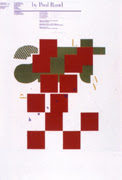
Pierre Mendell, 1986 - This is modernism due to the simple graphic portrayed in the composition. And the simple colour blocking is the minimalistic style that modernism portrays in there style.
This is modernist graphic design due to the use of grotesk typeface used which also is sans-serif within the composition. And the Main title is in the main focus with the writing flushed left within the whole design. The grid has been follows to strict regime and the colour pallette is very monochrome.
Postmodernist Graphic Design
John Weber, Flyer, 1984- This flyer shows a clear definition of a postmodern style due to its diagonal grid with the layout starting from all different angles and therefore making it very illegible.
David Carson, Ray Gun Magazine - This postmodern design is by David Carson who is a postmodernist his work, it all follows a no grid or structure. It has a use of mix media which shows his main style with difficulty towards the viewer with the legibility of the design.
Kenneth Hiebert, exhibition & symposioum poster, 1979- This is very postmodernism due to its style of using letter forms as objects this creates a well used approach of typography & using the imagination. Due the layered up style and therefore cannot see all the letter form but you use your mind to make sense of the word art. As its created in a intelligent way of allowing you to see the most important parts of the letter forms.
Cover for i-D magazine - This is postmodernism front cover design for a magazine due to the experimentation with photography and collage. The experimentation with colour and typography and shows relevance to the sex pistols god save the queen album cover. The design strikes a postmodern aesthetic.
| | | | | | | | | | | | | | | |
|
|
|
|
|
|
|
|
April Greiman and Jayme Odgers. Wet, magazine cover - This is a very strong postmodernist design due to its mixture of design styles including collage as well as geometric shapes. The irrational layout corresponds well to the postmodern era too through the use of no grid and organisation used within the magazine front.


No comments:
Post a Comment