Friday, 26 April 2013

Final Critique.


Final Critique

So in this crit we had to get into groups and had to prepare some questions in which we wanted them to answer. I wanted them to choose which design they preferred. As I did and wanted to do a large range but didnt know how to include them together:


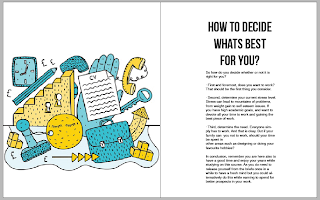
These are the different ones I have decided on from my research into style of layout. And I cans ee the theme of title page running throughout but they was no connection to be able to have all of them working together. They all chose the illustration as there best one. But this illustration took me a whole day and didn't think I had enough time to complete so I asked them to also pick a second best one as a back-up. And they chose the bottom one with watercolour style. 
They offered me advice such as go hire a waccom out at the mac suite and maybe use photoshop to speed things up. They said that they like the use of a title page but need to think more about colour scheme. They said the colour scheme of the illustration is very eye catching.


Saturday, 20 April 2013

Speaking From Experience Research Holidays


Speaking From Experience Cont...


I like these and I would like to incorporate them into my title page designs. I like the use of block & fine line typography, the detail is so delicate and has good typography layout.


I like this style of design using the watercolour as a background. Also I like this quote which I might use in my motivational quotes.


Found this project when researching. I like the use of incorperating it into another subject. But it works very well. The design is very clinical & fitting and there is alot of information and clever ideas gone into this.


 I like this phrase. I think its reassuring and makes you want to do what you have been told to do. As you want to show them that you can do it even though your on your own.


Friday, 19 April 2013

Second Crit SFE


Critique

I took in my design sheets I have developed due to not started designing on the mac yet due to the other things we had to do. So I took the following in:

 I have taken on board about putting more of a balancing theme in rather than just how to get a job etc... And putting information like how to prepare a CV....


 So in the box I have taken on advice from my last crit of putting relevant things inside the box rather than random things to fill it.


My peers Said:

I should make it informative but optional
Week planner should be included
Not too much info
Maybe focus on jobs inside college?
More about time keeping
Will it be too scary for 1st years?

The bold ones are the ones I think I need to take in and consider when devoping my idea even more.

Critique - Speaking from Experience

This was a really useful Crit we had to present infront of a small group with 3 design direction boards:

These are my Design Direction Boards:


This is my Feedback:

  • Find a way to interact with the audience
  • Talk about finding the right job.
  • How am I going to bind it?
  • Am I going to package?
  • Can I create stamps?
  • Newspaper stock seems relevant.
  • If formal make sure students will want to read it.
  • Consider addressing, how to manage the negatives?
  • Ensure all side products are relevant.
  • Can you use LCA logo as letter head?
  • Test different stocks as colours may not work
  • Look at both sides of having & not having a job?
  • Maybe use prices of things to help persuade?
  • Maybe compare compare two students one with a job & one without?
  • Having a job & studying benefits
  • Good primary research!
  • Interview Tips
  • Informative - will it be motivational to get a job?
  • CV Different templates?
  • Minimal text turn into posters?
  • Focussing on managing time would work
  • Is there many people on this course with jobs as a lot of work load?
  • Is a job necessary?

The bold ones are the ones I am going to take on board and try and think about them in more detail when starting to design the zine & information box.