Thursday, 15 January 2015

End Of Module Evaluation


1.  What skills have you developed through this module and how effectively do you think you have applied them?


I believe that my writing skills have improved within this module, this may be due to the regular use of the skill and therefore developing upon them. In my paper I found my paper has read more fluently this year compared to last. And therefore this shows effective use of this skill.


Secondly, I have developed a stronger understanding about senses, and therefore this will allow me to apply these within design seamlessly. This will be beneficial in the future to make sure my work stands out from others.


2. What approaches to/methods of design production have you developed and how have they informed your design development process?


I have improved my layout skills, throughout the poster and invite I created, my understanding of difficult folds has also improves, for example double sided and knowing when to reflect the text...


Due to my exhibition been based around an already well-established brand, this was a method that I had to develop as this was something I hadn’t done before. There I had to follow the Barnardos colour scheme and apply their logo following the brand guidelines.


I believe I have also developed my skills within mocking up. This developed through the practical side of my hand-in as it required a lot of mocking up due to me not curating the exhibition, which was a downfall, as this was the result due to not grasping my practical at the right time.


3. What strengths can you identify in your work and how have/will you capitalise on these?


I am pleased that did something more practical based rather than contextual as this is something I didn’t enjoy from first and second year and I have learnt from that mistake then. I really enjoyed my subject learning about the senses and how differently people learn depending on what learning style they prefer. This will be something that will be put into good use in my future education, as I believe that these are both important factors when designing something for an audience.


4. What weaknesses can you identify in your work and how will you address these in the future?


I believe that my time management was not this module as I think as I spent too long in the research stage, thinking I was getting a better understanding of my subject, when I should have read about one section at a time and then produced my written element. This meant that most of my Christmas was spent on the written element when I planned to begin my practical within the second week. I don’t believe this has affected my final outcome, although if I had a good grounding in what I wanted to do then I could have produced the exhibition rather than mocking it up. This may have also led to more of a range of posters with different messages.


Another element I found that created a weakness was my lack of motivation to write my dissertation due to my mental mind reminding me that I struggled with my writing structure. Which is still a downfall overall but this led it to be a bigger problem due to the inability to be able to go over my dissertation as much as I wanted to, to make sure all the sentences flowed and made sense.


5. Identify five things that you will do differently next time and what do you expect to gain from doing these?


1.     I will make sure that I will keep to my time management plan due to spending more time on my dissertation rather than the practical side as I felt this was the main section I would struggle with.


2.     I would make sure that I decided on my outcome of my practical in time to make sure I had enough time to do things such as my exhibition etc....


3.     I feel I would have experimented with different stocks to make sure the creasing of the cranes would have been of a cleaner fold. Due to the ink sitting and therefore transferring when been creased.


4.     I need to start making more photography slot, this will not only make my work look more professional but will also build my confidence when doing photography.


5.     I would have liked to have had more replies from my contacts that I emailed therefore I should have pestered Amber to pass on the list that she said she would collate or I should have nagged for replies of the people I already contacted. Although, I had done two primary research I do wish I had more time for primary research as I really enjoyed my experiment.


6.How would you grade yourself on the following areas:
(please indicate using an ‘x’) 

5= excellent, 4 = very good, 3 = good, 2 = average, 1 = poor

1
2
3
4
5
Attendance


x
Punctuality


x
Motivation


x


Commitment


x

Quantity of work produced


x

Quality of work produced


x


Contribution to the group


x
The evaluation of your work is an important part of the assessment criteria and represents a percentage of the overall grade. It is essential that you give yourself enough time to complete your written evaluation fully and with appropriate depth and level of self-reflection. If you have any questions relating to the self evaluation process speak to a member of staff as soon as possible.


Wednesday, 14 January 2015

Design Boards - Practical

These are my final six boards explaining the concept of my practical COP3 and the synthesis between my practical and written content for this module.

Tuesday, 13 January 2015

Rationale

My essay concluded that print overall was more effective in terms of getting the audience engaging due to the VAK learning styles. Although, the kinesthetic learning style is all about learning through movement it will also engage other learners who are auditory learners, through the ability of them being able to talk about what they are doing, and visual learners, who have the opportunity to on look at others to see what they are doing. Therefore you could argue that print is the most engaging as the kinaesthetic learning style caters for all styles. Therefore all learners’ will absorbs information when working hands-on psychically either from speaking about their process or observing others. This leads to print being more effective when communicating across the subject matter to the audience due to the capability to cover all learning styles.

I also concluded that it was mainly dependent on the message they wanted to get across as sometime digital wouldn't best suit the audience visa versa... 

Therefore as a response to my finding especially with the engagement model, this has influenced my practical, following the stages of the engagement model closely I have created an exhibition which requires the participation of the audience. The idea of rewarding the participants has also been applied due to the inability to allow them to keep the paper crane, they will be given a sticker instead.


Saturday, 10 January 2015

Mocking Up The Exhibition

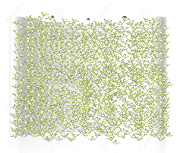
 Firstly I made up some paper cranes using the printed final posters, then I out string on them and photographed them so I cut put them within my exhibition.


This is the finished outcome, I also had many other cranes to show different angles like they are swinging on the string in a line....  I have also applied a drop shadow slightly so they look more realistic.


This is what the front of the exhibition is going to look like. This was very hard to mock up as I found it difficult to find the right setting. I was very close to creating the set up I wanted myself before I found this picture.... The posters sit on the stands at each side and the middle stand will be where they can rest to create the paper crane. The roll down poster on the right will eventually be filled with stickers when we reach the 1000 point.... This is how we keep track with the amount of paper cranes we have.


This is what the back of the exhibition will look like when the exhibition is complete... I wanted this to make sure that they was intrigued to see what they would do with the paper crane... If you could see the mound of paper cranes then you will know what you are doing? and why you are doing the task! Therefore keeping this at the back will still keep people intrigued etc...


I thought that it would be best to do some promotional material to go alongside the exhibition so people can be aware of this happening and return within the time frame given if interested or intrigued. As it doesn't give to much information away... It states "how to build a paper crane" but this is not the main aspect of the exhibition.


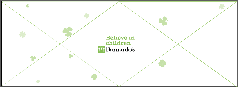
This would be the que barrier that we would use if lots of people wanted to partake within the exhibition. This is promoting the charity also, showing that this is an exhibition created around and making money for the given charity.


These where all important aspects to follow my synthesis. This knowledge of creating a audience engagement has developed from research for my dissertation. This ideology was created by Zafra Bilda who believes that you have to advice them clearly and encourage them to take part within the experience, but not in such a way that tells them what happens. This is because telling them clearly about the engagement shapes this, and encourages them to get involved with the experience. 


Friday, 2 January 2015

Rewarding the Participant....

So as a reward for my participants, in which has been found from research within my dissertation works very well to get people taking part within the exhibition....

The initial reward is seeing the paper crane build up, you get a self reward because you are proud of what you have done... Although, they don't to keep this crane, so therefore I have decided to carry the feeling of been rewarded through a sticker that you get when you complete the paper crane... You get to put a sticker onto the record chart and also you get a sticker to put on yourself....


These are the stickers we are going to use to keep a record of the amount of cranes we have... This is just simply a crane, which is taken from the inspiration of the paper cranes created from the poster.


This is the sticker for the maker, this is says today I've been a luck charm... This is rewarding as this is telling people that they have done good... The idea of been a lucky charm is something of value and therefore this will make people curious when they see people walking around with the luck charm sticker.... Again remember the target audience is for children so therefore this is a good reward for the target audience.

Sunday, 28 December 2014

Invitation Design Development

So from the research I carried out I noticed that you need to get the audience to engage in some way. The reason for an invitation is that you don't necessarily go to the mall so because it's there a short amount of time, if you get invitation you might make a special journey... this is setting the audience, by not giving too much away as we don't want them to be either too high with their expectations but also enough to make them want to come..

Firstly I worked out how I wanted to make the invite interactive as this would need to match alongside the exhibition. 

So I thought about a simple fold that would make in the invite into an interesting layout and shape. Also, maybe give them a little gift to get them thinking about the exhibition and make them want to investigate with the paper crane...

So i have come up with the idea of a diamond shape as this is the outline of a Celtic knot. Again making the connection with luck and the Irish.

I ripped a piece of A3 paper in half  and folded from the centre to make a diamond shape....

 I noticed that I could folded the edges in to make a gate fold and therefore the information inside would be sealed with a grand opening of the two sides. This was just a happy accident.


 So this is what it would look like if it was folded in... I like this because the idea that the information is concealed and therefore people will wonder what is inside so they will make the initial interaction. Also it is small, compact and can be stored/stacked easily.


This would open like this so I could follow the creases of the paper for my layout, following the aesthetic of the back of my poster...


So I created a simple template on illustrator to follow to make sure all the elements worked. I thought using the same title as the poster and the same style would create a connection and then people would be like oh that's what those invites was for... etc.. I have block coloured the diagonals as this is going to be the outside of the invite. Now to create the front, which will be divided by a gate fold.


 This will be the front of the invite, this is giving them slight details with an illustration which will create curiosity and make people open the invite to find out more...


 Although this will be divided like this so that the fold can create the enclosure...


This was my initial thoughts as I thought having the charity hidden by the mini paper crane we are going to have in the middle will be a grand reveal, but then I thought this might not be a good idea people might be more inclined to read if they can see the charity logo.


So I chose to put it in the bottom left.... This is not the first things they are going to look at but at least it doesn't need something to be removed for them to see it. Also a small caption has been added to tell them a little about the age range and telling them about the concept of luck.. The how to build a paper crane will only be revealed if the invitation is fully interacted with... Therefore these are the people that will most benefit and enjoy this task...


I have put that it is around St Patrick's day this will given them some connection and therefore won't forget what date if the invitation is lost etc... I have now put how to build a paper crane underneath where the crane will be placed to give them some information as to why the paper crane is there but not in too much detail.


 I have also put the date, as I realised that this would just be relating to one say if St Patrick's day was left to be the only date contact info... I have now out dots around the crane to connote that this is what the whole exhibition is about... But this is only a slight clue and not everyone will put two and two together.


This is the final outcome, all sections have some information on them... And it all looks evenly balanced out with the focus on the paper crane.... This invite is giving away everything but nothing directly, therefore create curiosity, which is the main element to make people come and engage with the exhibition.


This is the final printed outcome.... 


The paper crane doesn't fully cover up the writing which I am glad about as you can see there is information underneath that needs to be revealed, therefore more people will be inclined to remove it..


Monday, 22 December 2014

Additional Material? What else does it need?

I need to make something to make sure we get enough support...
To make sure people spread the word.... 

Promotional Banners around the mall.
Invite to send to people - exisiting Barnardos volunteers, leave in mall near guides.
Que barrier to make sure people know what the others are queing for..?

Insipiration for invitation

I like the idea that they have to do something to make the detail legible... This is formed from a simple instruction....


 I like the use of folding as this will have the same concept as the paper crane...


 I like the idea of folding the paper to create an unusual shape...


I love this invitation, although is it practical? Once it is up its up and therefore depending on where your receive this you might have no where to put it..


I am also going to mock up the other too promotional items as i think these will all be beneficial for the engagement mode.